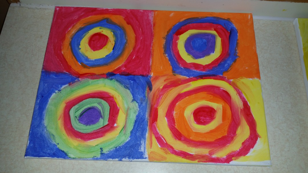
Art doesn’t have to be fancy to be beautiful or inspiring. Kandinsky’s Color Study: Squares with Concentric Circles is the perfect example of that.

Originally created as a small study on how different colour combinations are perceived, the painter used it along with his creative process as a support material. Now it hangs in galleries beside other great masterpieces.
To imitate or create your own version of this art you must first understand Complementary colours.
Complementary colours are pairs of colours that when combined cancel each other out (creating black, white, or brown) but when placed next to each other the produce the strongest contrast for those two colours or in other words they POP. Red and Green or Blue and Orange are prime examples of complementary colours.

The colour wheel above shows you how to figure out if a colour is complementary or not. The farther away from each other the colour is the more complementary they are.
Now lets paint one of our own.
Materials:
- Canvas or Paper no smaller then 8 1/2 x 11 (the bigger the better),
- Paints
- A Ruler
- Pencil
Directions:
- Divide your canvas into equal squares using the ruler and pencil. 4,6,8 etc. depending on how big or small your canvas is.
- Start with a dot of paint in the middle of one square about the size of a quarter, any colour.
- Next paint around the dot in the middle with a complementary colour. (if you chose purple to start, then use yellow next) make the line thick or thin whatever inspires you at the moment.
- Continue by switching colours till the circle is about as big as the square then fill in the square as well again using complementary colours. Never put blues and greens beside each other, or purples and pinks, the colours should always contrast and always POP.
- Repeat with each blank square till the canvas is completely full.
Now you have your own version of Kandinsky’s Color Study, which goes with any decor or any colour scheme.
Here are some example from the participants of Kreative Kids.
